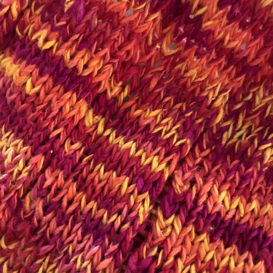
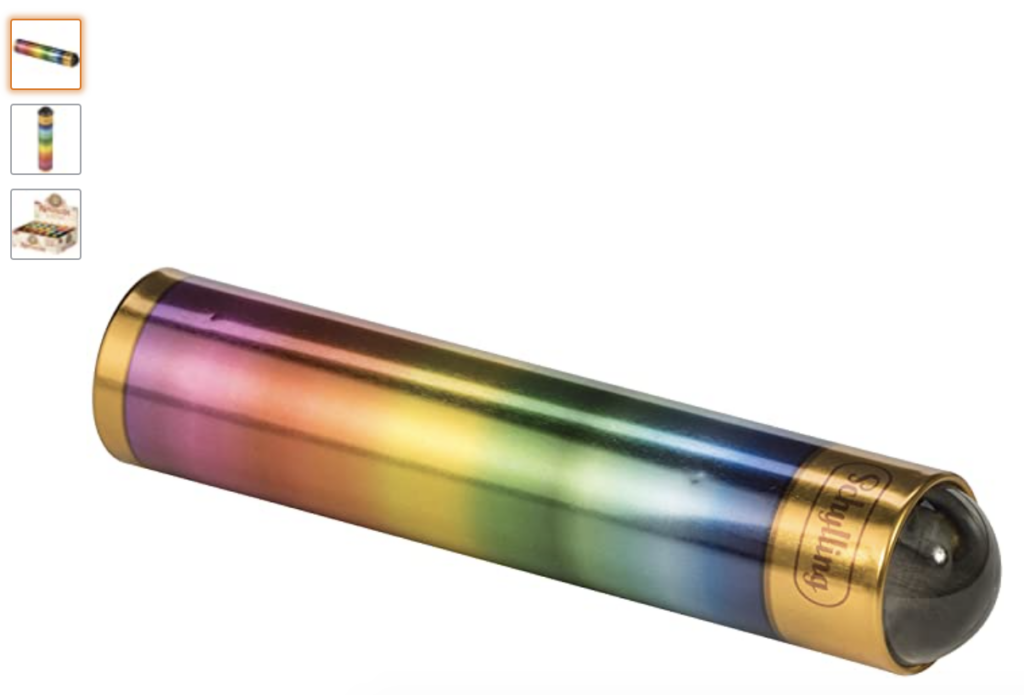
It’s another gray day in New England, time to jazz up the colors a bit with my favorite go to tip for color work – use a kaleidoscope to help you pick colors. It’s easy, just lay out the yarn in the order you are thinking of using it and give the kaleidoscope a whirl, literally, to see the colors blend together. Do you love it? Take a photo of your color combination and get stitching. Hate it? Do another stash dive, see what you find, and give it another whirl.
If you are working on a project with accent stripes, try to set up the colors in the proportions you plan to use them. For example, if you have 1″ of hand dyed tonal yarn and 3″ of a solid color, try to set up your work area with the yarns in the correct proportions.
For the tech enthusiasts among us, yes “there’s an ap for that” actually several however I find they are not as accurate. Cameras in smart phones use digital enhancement to make the photos more appealing, this is absolutely not what you want to happen when you are considering colors. You need to see the actual color interplay not the iOS modified version thereof.
So get out that stash and start matching up your colors.
It doesn’t take a lot of special tools to make good choices. Here’s my favorite:
Comments are closed